Gardin
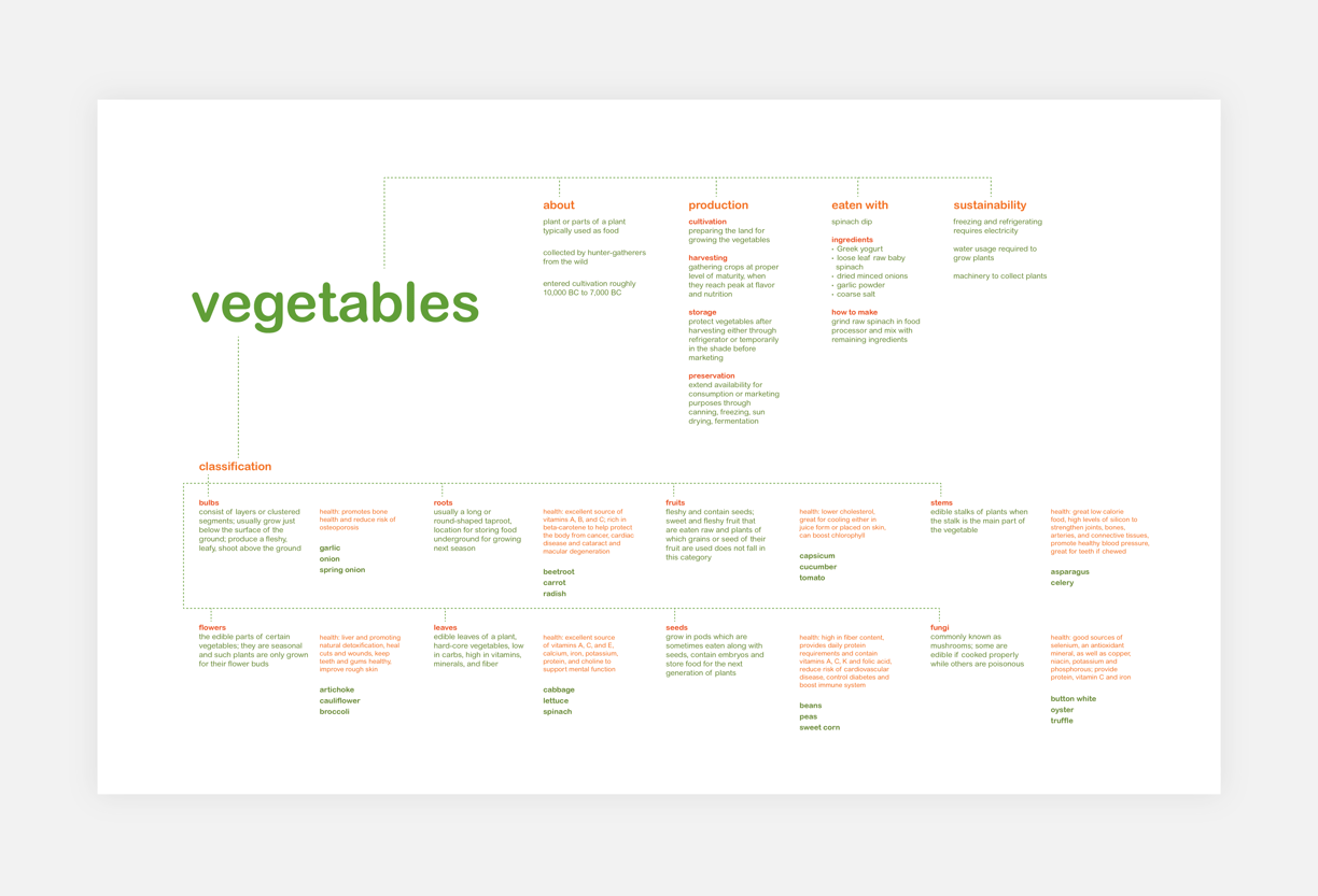
Research/Concept Map
This is a brand and free-standing retail site for a shopping mall where people can buy vegetables with spinach dip for a snack while they shop.
Brand
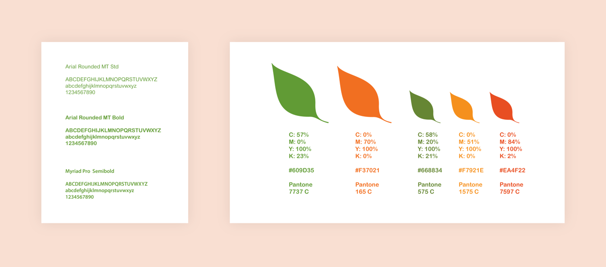
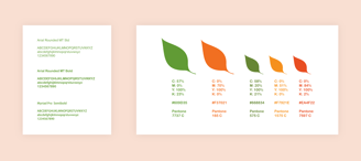
To match the spring season feeling, bright and mostly warm colors were used for the kiosk and for different variations of the logo. Light green and orange are primary colors while olive green, yellow, and red are secondary colors that enhance the brand.
Arial MT is used for any standard text within the brand to match the feeling of it. The logo letters came from typing the name in Myriad Pro Semi-bold and rounding all corners of the letters.
The name gardin comes from the English word garden, which is where the vegetables grow. While the pronunciation stays the same, the “e” is changed to “i” to spell “in,” giving people the feeling of being invited to enjoy a healthy snack fresh from the garden.
The overall brand is simple but colorful and bright since eating veggies should enhance people’s lives. Therefore, the logo contains rounded letters and the leaf represents plants and only “in” is inside of the leaf to show the action of going into a garden.
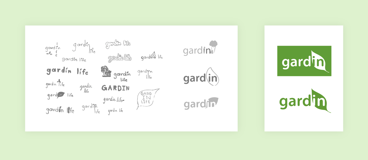

Name and Logo
Colors and Typography
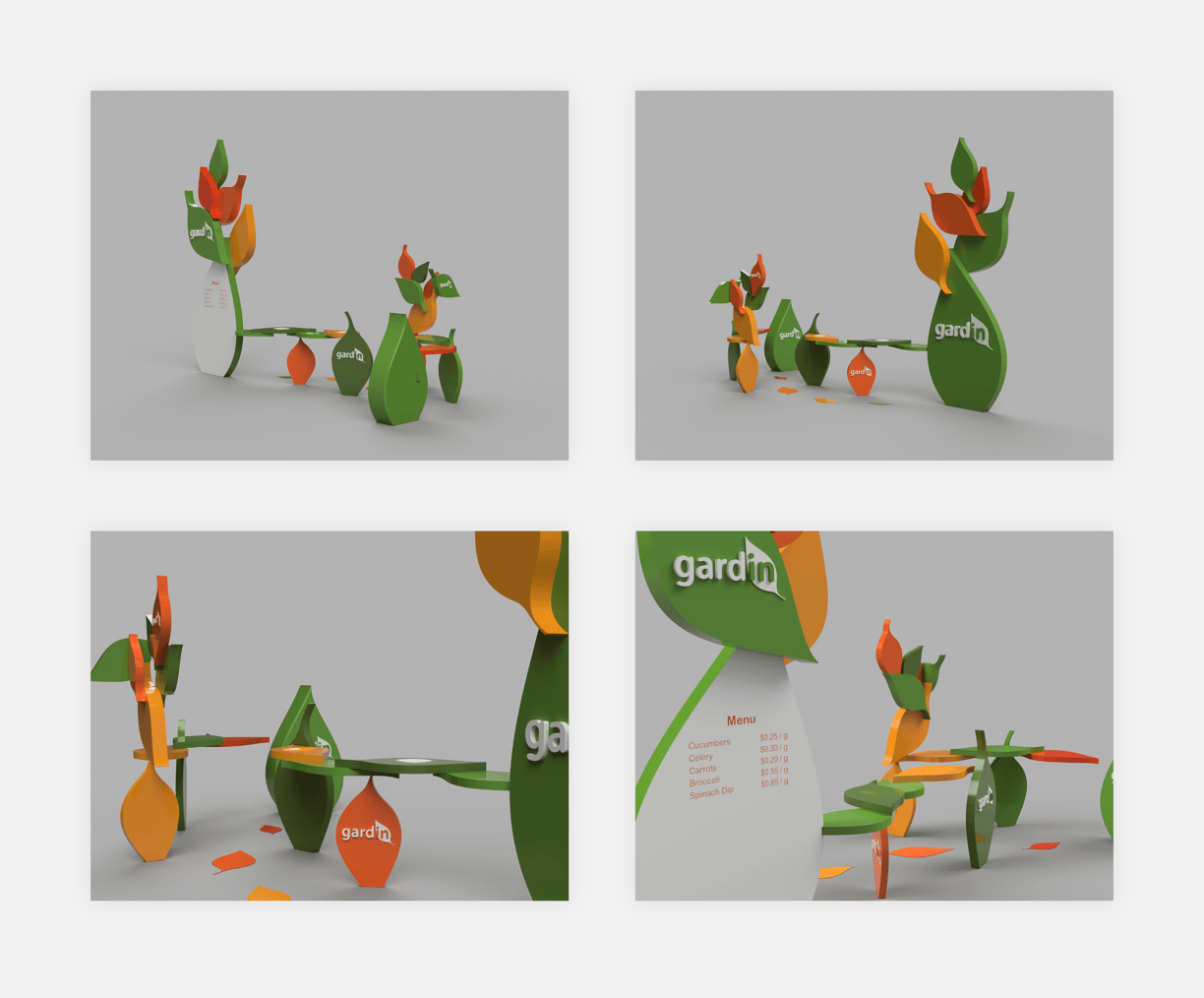
Kiosk Design
The shape of the leaves used for the tables and the display structures on the kiosk are the same as the leaf shape on the logo.
The big leaf panel is the starting point with the menu and people can follow the path of the leaf-shaped tables that contain all the veggies listed in the menu. People can grab food from either side of the tables and the floor graphic helps guide people coming from that side.
There is also a gap between the food tables and cashier and promotional item tables that people can walk through after grabbing their food, large enough for one-way path.
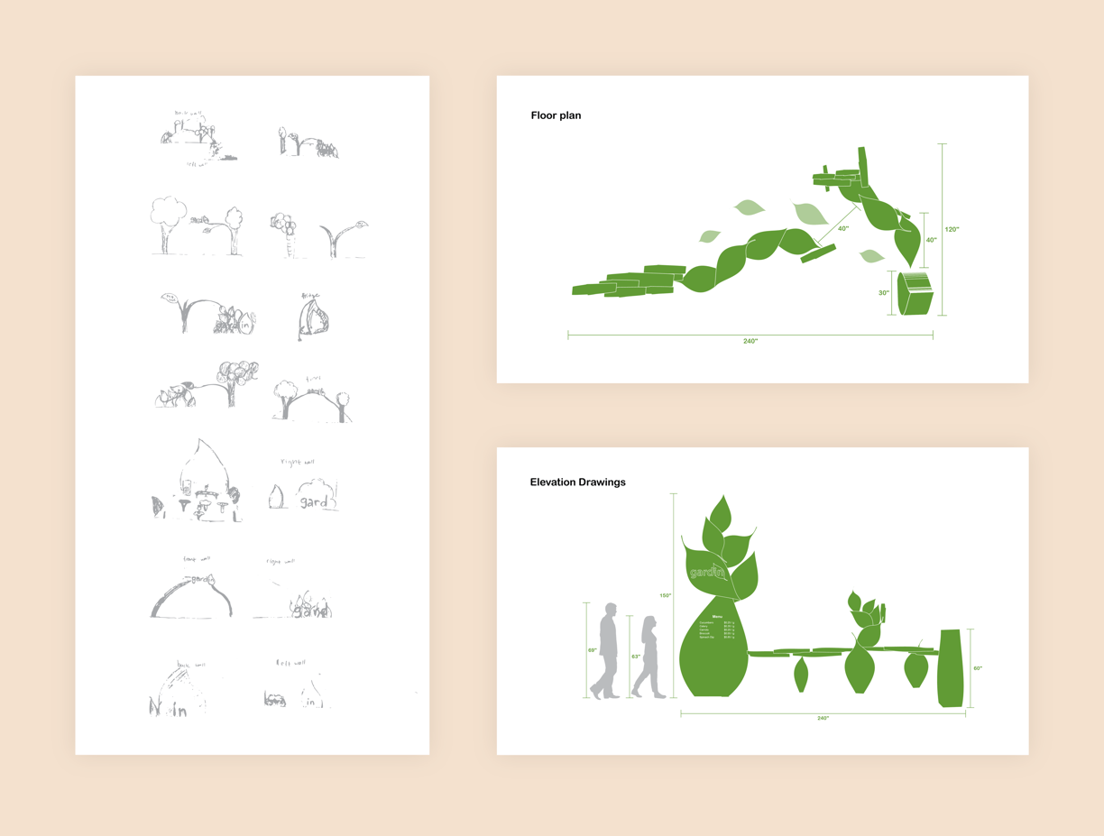
Final Design (Created in Autodesk Fusion 360)