HR Consultancy
Introduction
This is a brand and responsive website design for an HR management company that helps its clients with small and medium-sized businesses navigate complex issues involved in the HR department. This client was a fairly new company that started a few years prior to getting this project.
Background
Goal
The client needed a visual identity that would help them stand out and look more professional. So I was tasked with designing for them a logo, brand system, and use that system to design a website which would be developed by the web developer.
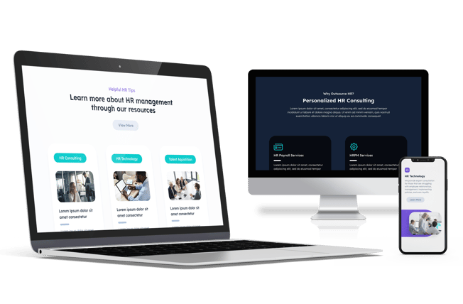
We had limited time to complete the project, and also before reaching the final output, I created a different website design which they initially approved and the web developer started coding. However, they suddenly came back one day saying they wanted to go in a completely different direction, so we basically had to start over. Luckily, they allowed us extra time and while there were still lots of back and forth, we finally came up with a design they were happy with.
Challenges
Inspiration
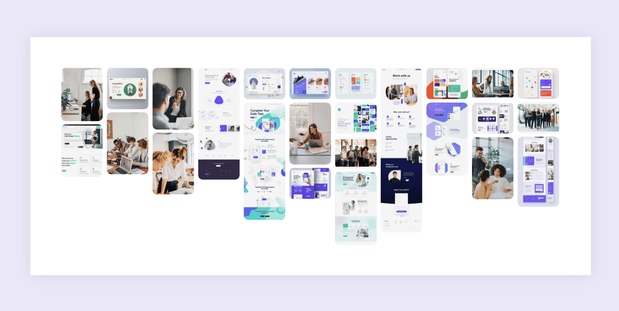
The client wanted a professional, clean design, but also modern enough to not look like a standard corporate website. So I created a moodboard which helped get ideas for clean layouts, colors, style of photography, and explore other shapes besides the standard rectangle boxes. Note that all images in this moodboard are sourced from Pinterest.
Information Architecture
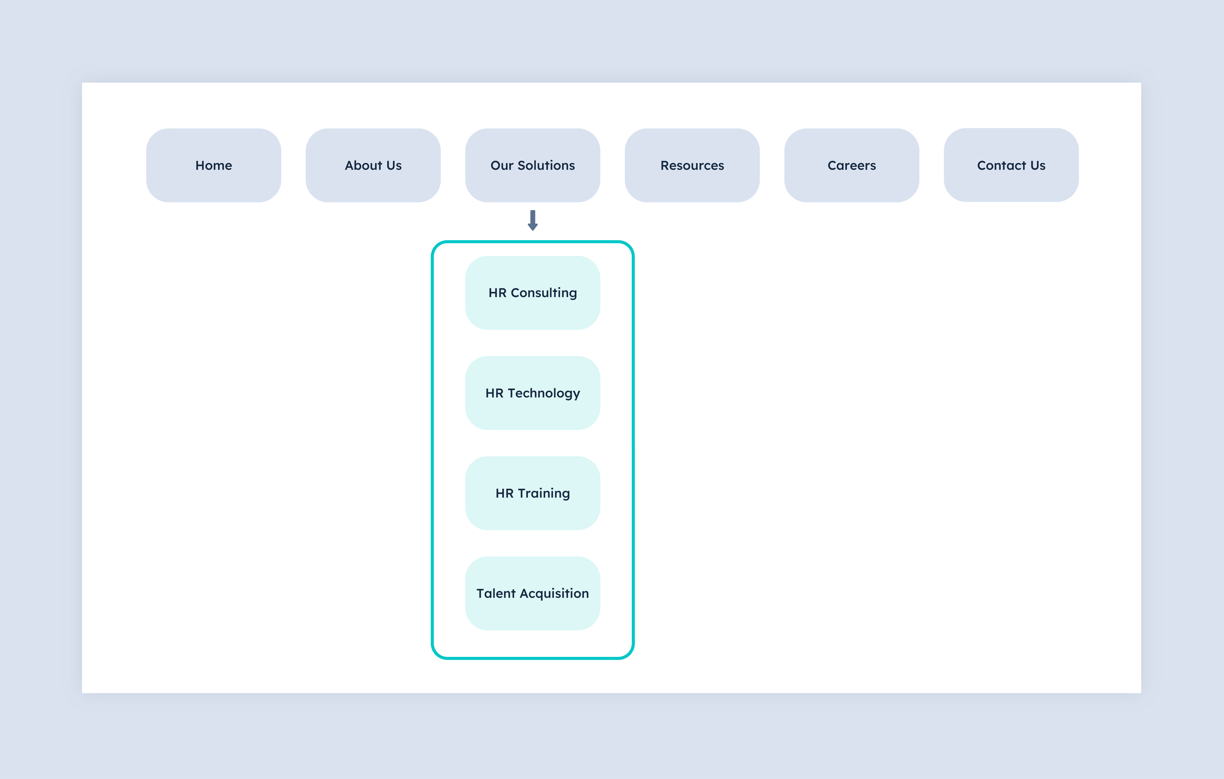

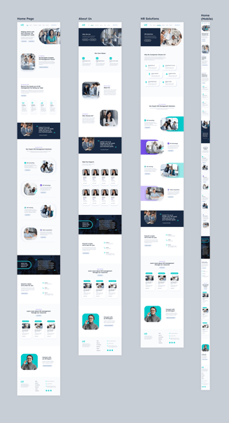
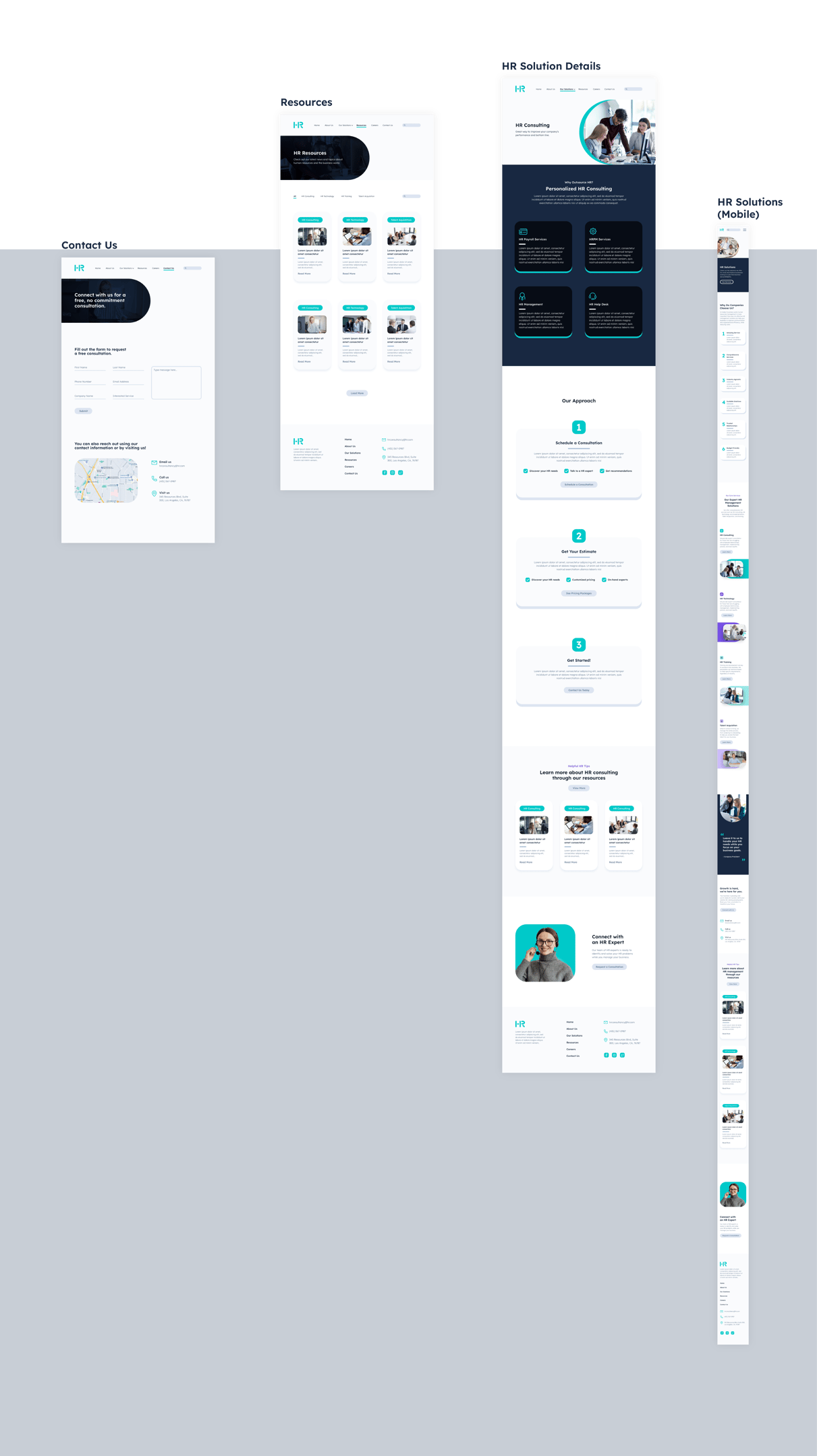
The client had the content ready, but needed help structuring and organizing the information. They wanted to highlight their purpose and four main services (HR consulting, HR technology, HR training, and talent acquisition), so the pages were created and organized accordingly.
Brand Design
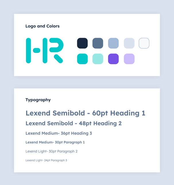
Another unique aspect of this brand is instead of using the standard neutral colors like pure black and grays for the main text and buttons, different shades of a less-saturated blue are used. Additionally, teal and purple are used as the accent colors sparingly for the icons, shapes, and to highlight any sub titles.
To give the brand a more unique and modern look, I used rounded- shapes and corners throughout the website design and the logo was also designed accordingly. Note that for confidentiality reasons, the logo uses the letters "HR" instead of the original letters, but the general style remains the same.
Logo and Shapes
Colors and Typography

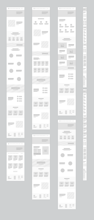
Wireframes

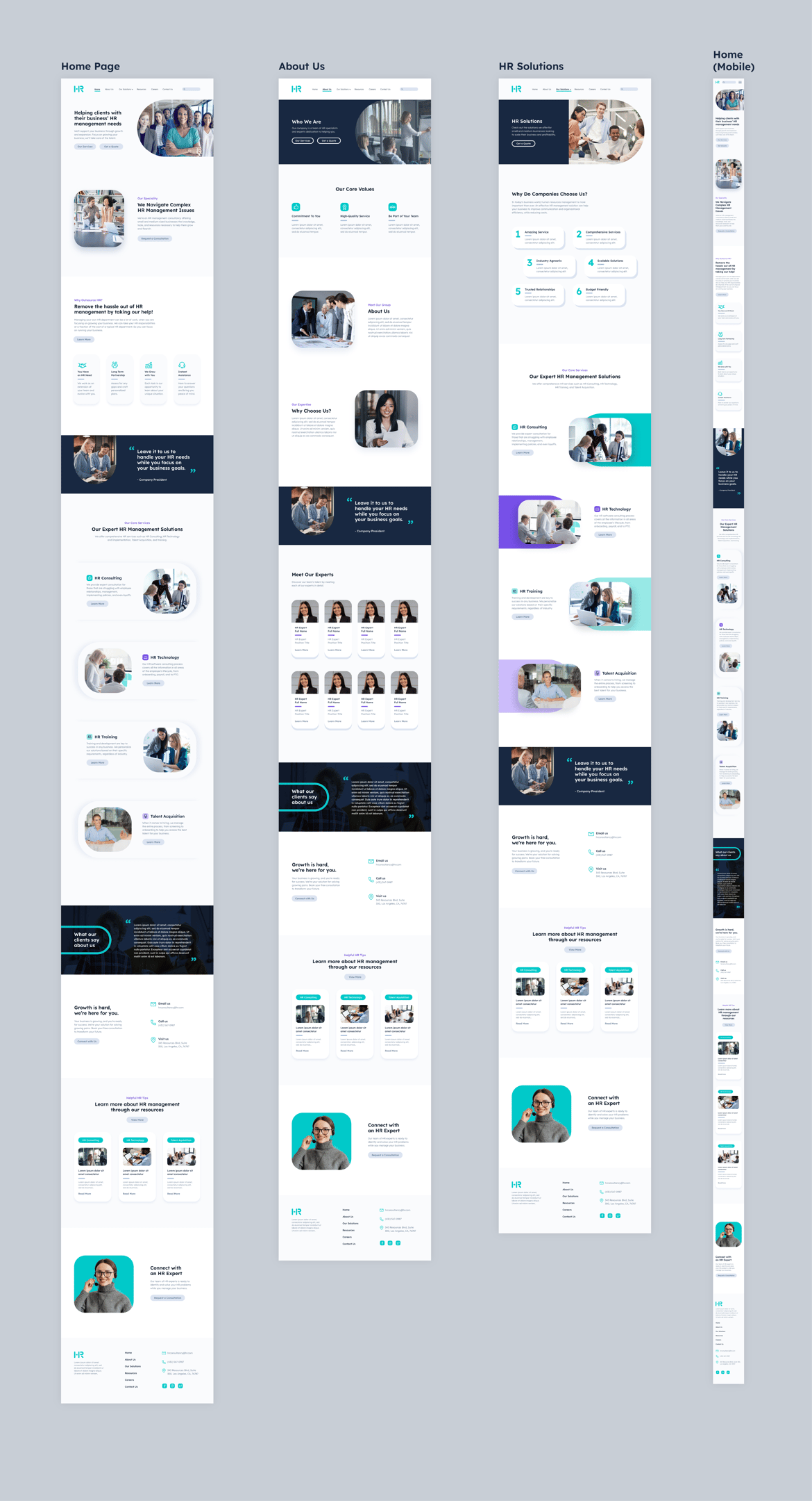
High Fidelity Screens
USER FLOW
This is the user flow from the home page showing company overviews, then details about the services, and finally, contacting the representatives. *If video shows as unavailable, please reload the page.


