Wonderphal
About Wonderphal
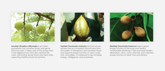
This is the branding and packaging for Wonderphal, a healthy, traditional Ayurvedic herbal formulation of three fruits native to the Indian subcontinent. This is originally called Triphala, meaning “three fruits” in Sanskrit.
Each fruit making up this beverage has its own benefits to certain parts of the body. It assists in weight loss while eating a healthy diet and exercising the proper way, and promotes healthy eating habits by supplying the body with natural tastes.
It consists of five out of the six tastes recognized in Ayurveda, which are sweet, sour, bitter, pungent, and astringent, leaving behind salt. The initial drinking experience may be unpleasant for those who are not used to eating or drinking bitter items but will get better overtime. Mix half of a teaspoon of the powder into one cup of hot water.

Sustainability Research
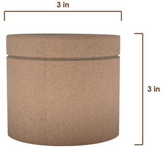
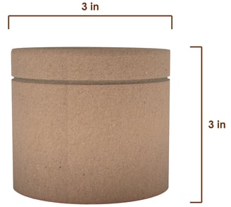
Extensive research was done to figure out the most sustainable package material for the beverage. Research shows that paper is the largest material type in the packaging market. It is becoming more demanding with the increase in bans on lightweight plastic bags. The packaging industry is demanding more eco-friendly and environmentally sustainable packaging materials.
Polyethylene is the most common type of plastic used as coating in paper food packages to keep the contents fresh for a long time. The downside is this additional plastic coating makes recycling paper more difficult. However, this can be overcome through delamination, the process of separating the thin plastic coating layer from the recyclable paper material. While it requires the use of other chemicals and careful treatment, it is more environmentally friendly than full plastic packaging, which is more difficult to get rid of and unsafe for the environment.
Cardboard material is easier to recycle into new paper products because of the way distribution facilities produce clean cardboard waste. Recycling 1 ton of cardboard can save 17 trees, 7,000 gallons of water, 5,000 kwh of energy and 1 ton of CO2 emissions.
Brand
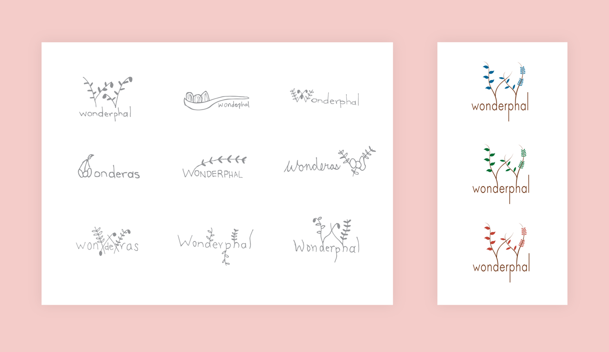
The “phal” in Wonderphal translates to “fruit” in Hindi. It sounds similar to the English word “wonderful”, which represents how amazing and healthy this drink is.
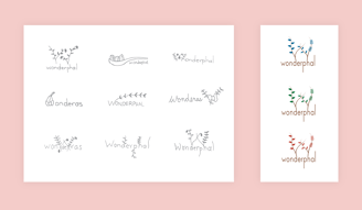
The idea of the logo is to have the branches integrate with the letter forms. The ascenders and descenders of the letter forms are extended to make the branches.
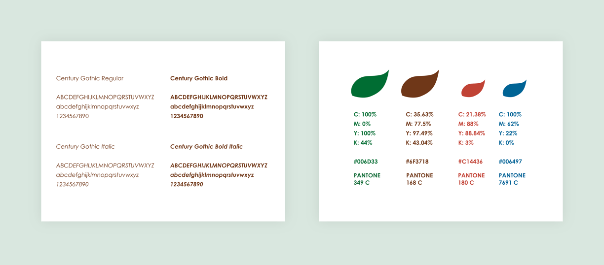
Century Gothic is the font used for both the logo and for body text on the package design or anywhere where the brand is applied.
Brown and green are the primary colors that represent nature, and are used for text in the brand and package. Blue and red are used in the supporting graphics. Green, blue, and red each represent the three Wonderphal flavors, hence the three versions of the logo.
Name and Logo
Colors and Typography
Package Design
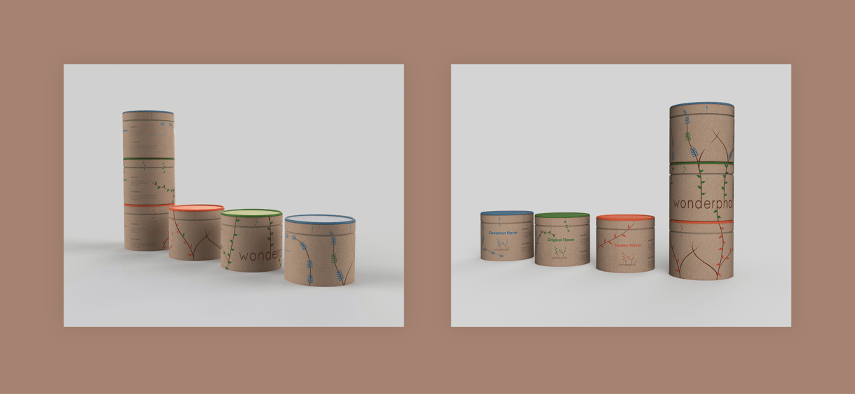
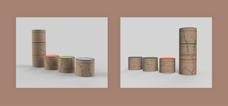
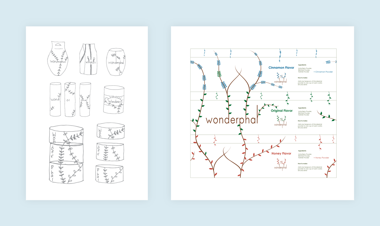

Using the leaves and branches as additional graphics helps give the brand a feeling of nature. This aligns with the beverage being like a natural medicine made from fresh fruits.
To the right of the sketches is the flattened version of the graphics for all three flavors' packages combined. The package is meant to be sold together stacked in the order of the graphics and can be taken apart after purchase.
Final Design (Created in Autodesk Fusion 360)
